
UX CASE STUDY
Integrating In-App Booking

Duration
80 hours
Organization
Helpr
Role
User research, interaction design, UI design, prototyping, usability testing
Tools
Adobe XD
Helpr connects working families with high-quality, affordable backup care. During the coronavirus pandemic, Helpr began providing online academic and enrichment services (eg. tutoring, language learning, extracurricular activities) called Helpr Online to families who are missing their school support structures. Helpr wanted to integrate the scheduling and booking of these new services, which is currently hosted externally on SimplyBook, into their existing app.
I designed a native booking feature for the Helpr app that aligns with existing user expectations of Helpr Online's booking flow. My work highlighted the importance of the UX design process for Helpr as it resulted in actionable data for future decision making and insights about their users to improve the Helpr Online experience as a whole, not just this booking feature.
CHALLENGE
Creating Harmony Between Services
Helpr Online emerged as a separate service in response to the changing working and schooling conditions brought by the pandemic. The process to book Helpr Online sessions is inconvenient and tedious as sessions are booked by using the SimplyBook platform on a separate web browser.
This results in specific pain points:
When users want to book Helpr Online sessions, they are required to create a new account for SimplyBook, and are directed from the Helpr app to a browser window.
The platform is not very responsive. An advantage of SimplyBook is desktop access, but primary Helpr services are booked on mobile only.
It is hard to navigate the different service offerings.
How might we design a more integrated user experience that overcomes the pain points introduced with a third-party scheduling platform?
SCOPE & RESEARCH
Understanding the Comprehensive Picture
Helpr wanted to bring the booking process for Helpr Online into their existing app as a new feature as it would consolidate their service offerings in one place. However, there was little data to inform how that booking feature would look like in the app, so in my research, I aimed to understand Helpr as a company, the problem space, and assess desirability and feasibility of the feature.
Goals
Define the project scope and understand Helpr's goals and constraints
Understand target users' motivations, goals, needs, and pain points for using Helpr Online
Identify strengths and weaknesses of competitors
Validate the product feature
Stepping into an existing environment
Needing to quickly understand the industry, the company, and the users, I combined
Stakeholder interviews with the client to learn about their business goals and constraints for the project, take stock of the work Helpr may have already done, define the project scope, and get a general understanding of their users and the childcare industry,
Market research to familiarize myself with the problem space and trends, especially how the pandemic has affected work and childcare,
Competitive analysis to to identify strengths and weaknesses of competitors and learn common design patterns for booking and scheduling flows, and
Survey feedback analysis to understand how users have been using Helpr and/or Helpr Online and identify any pain points with the app. Access to the Helpr user base was not available to me at that time.
Results & validating the feature
Helpr Online users are typically working parents, who are now working remotely full-time and have kids in high school or below also at home. Working parents
Are busier than ever as they must juggle the responsibilities of their jobs, the household, and childcare — primary forms of childcare (eg. schools, daycare, grandparents, etc.) have naturally been disrupted due to the pandemic
Often feel like they have to choose between their jobs or their kids as they cannot give the proper time and attention to either
Are concerned about how well their kids are doing, especially in school
Therefore, a service like Helpr Online can and does support working families.
The research affirms that a native booking feature that eliminates going through a third-party platform is desirable because it avoids the hassle and saves time. It'll be one less thing they'd have to deal with among all the other things they have going on.
I encapsulated this research into a persona and empathy map to keep users' needs and motivations at the forefront when designing.

As a busy, overwhelmed parent, Elisa needs the feature to be seamless, intuitive, and fast.
DEFINE
Planning Out a Native Booking Feature
Research validated that incorporating the booking feature for Helpr Online into the existing Helpr app would already address a pain point that users were experiencing; it would remove the additional step of being directed out of the Helpr app to an external browser, where the SimplyBook platform isn’t very responsive.
Ensuring a consistent user experience of the product with my new design was essential so I studied the app environment, Helpr's branding, and the existing booking flows.
Goals
Get familiar with Helpr's design system and app environment
Understand the existing Helpr Online booking flow on SimplyBook
Determine the screens and UI elements that need to be designed that incorporates the existing flow into the existing app environment
Mapping it out
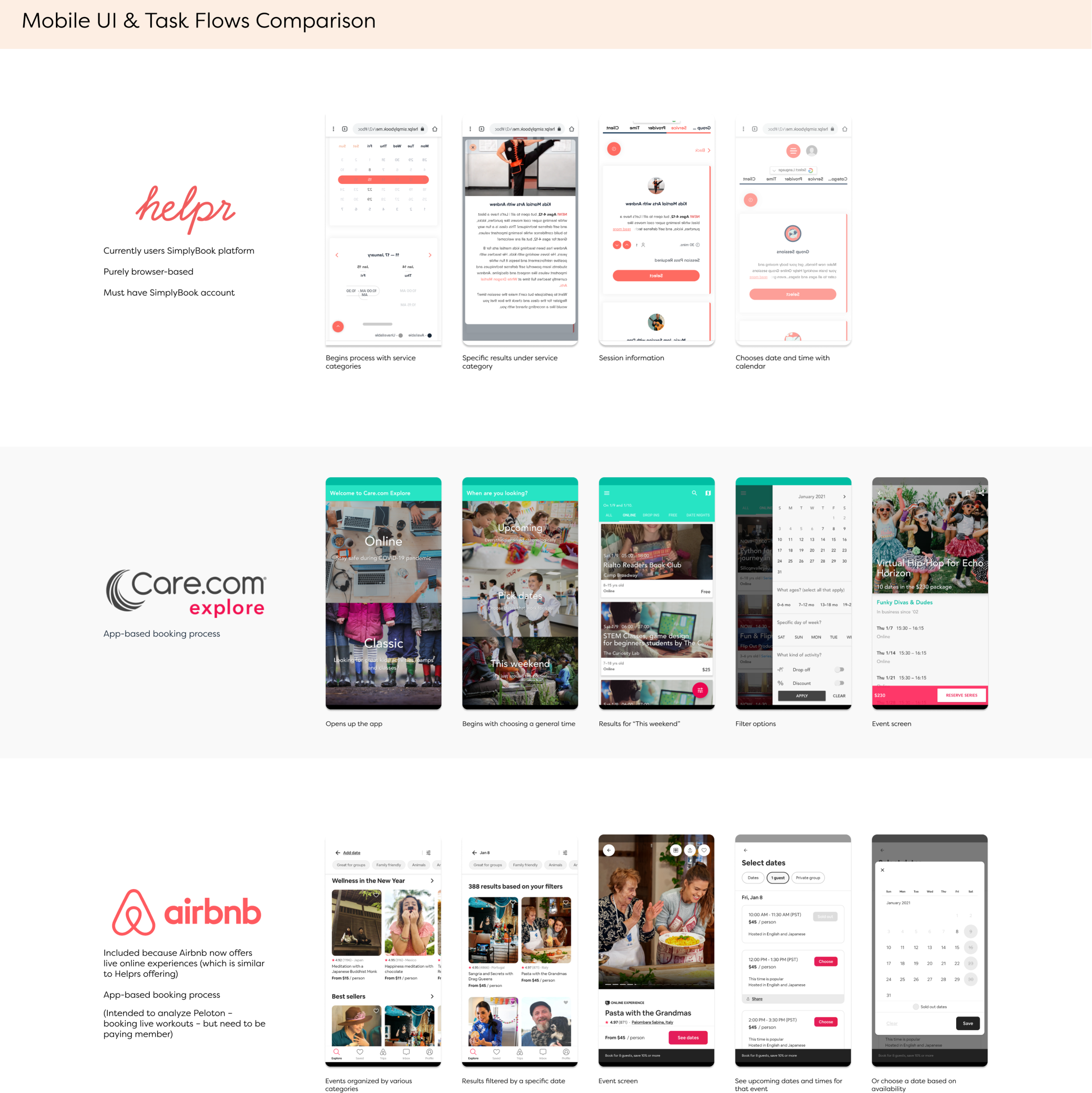
What did existing flows look like? How could they be integrated into one platform, while respecting technical constraints.
Learning the app environment
I downloaded the Helpr app and mapped out the existing flows of booking primary Helpr services via their app and Helpr Online services via direct to SimplyBook. This helped me get familiar with Helpr's design system and identify where the native booking feature can live within the existing app.
Understanding the booking flow
The app map was adapted into a user flow depicting the completion of the SimplyBook flow within the Helpr app, thus outlining the screens that would need to designed.
I decided to maintain the existing SimplyBook flow because this is a flow users already expect and there was little data to inform how to change it, if it needed changing.
Following design patterns for mobile
I mapped out the SimplyBook flow, as well as similar booking flows, to reinforce the purpose of each new screen within the user flow and to list the UI product requirements needed on each screen.
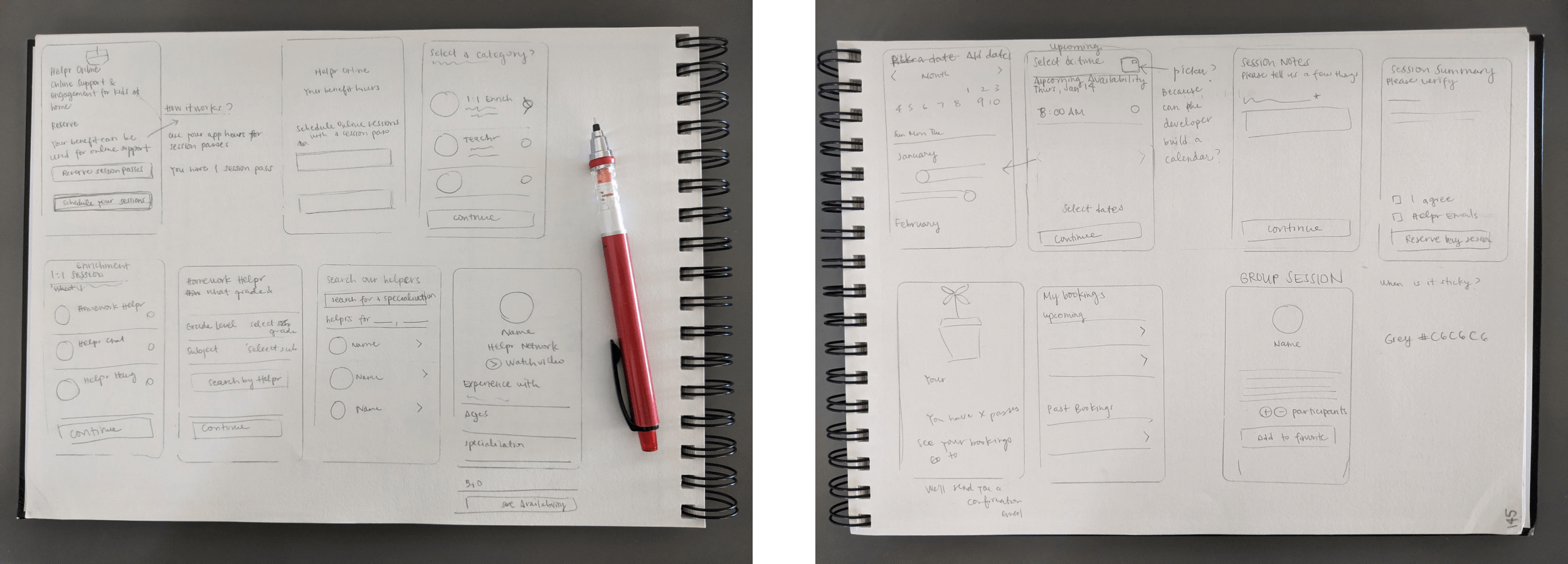
Sketching wireframes
Subsequently, I was able to quickly sketch out wireframes of the feature by combining the app map, user flow, and UI product requirements. Now I had a plan for digitizing the feature.
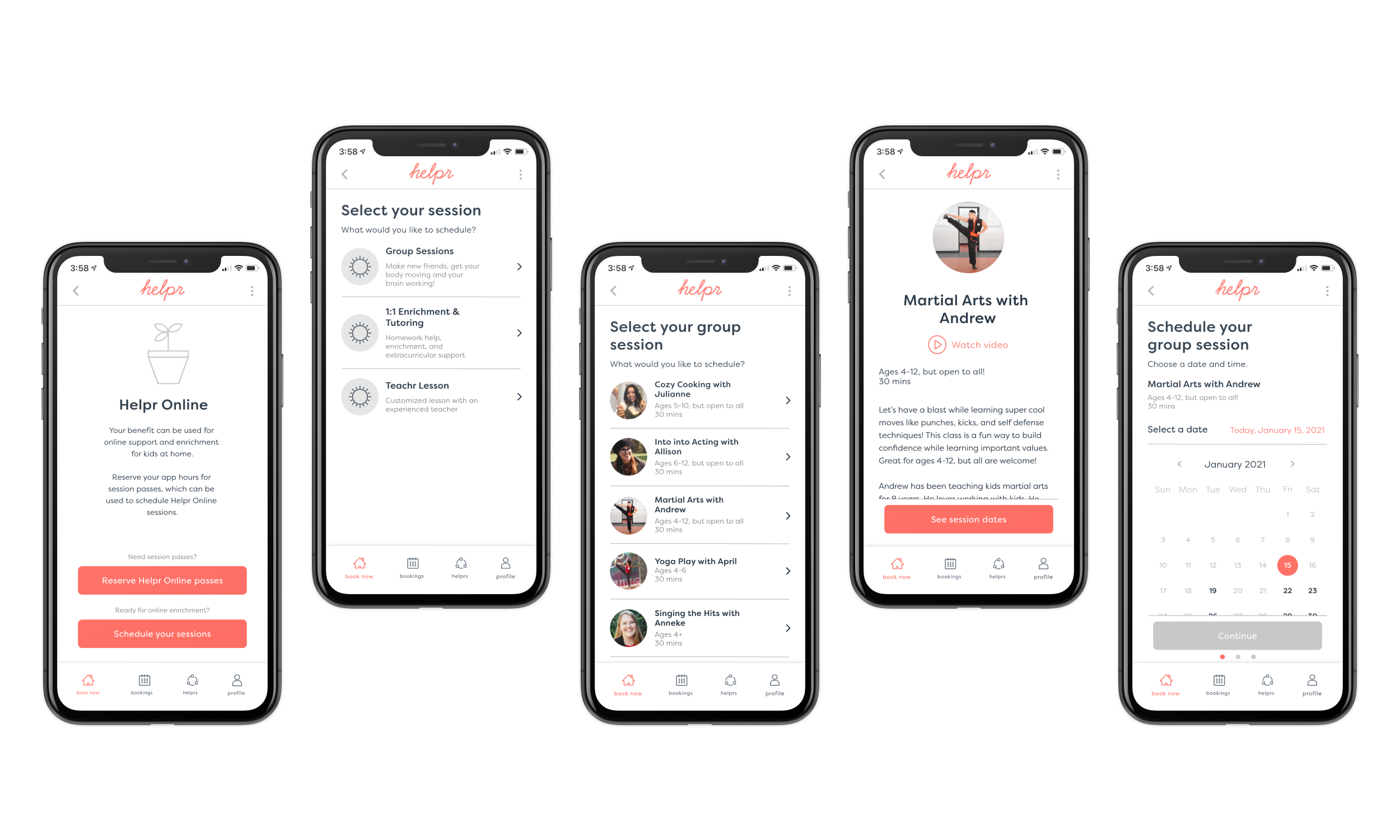
DESIGN
Incorporating the Feature into the Helpr App
The feature overall maintains the existing flows and copy and is consistent Helpr’s design system and specs, with a few small additions to accommodate user preferences.
Working as an external designer, it took time and effort to understand the business, the app environment, and Helpr's goals and constraints in implementing a new design. I was not able to confirm the feasibility of my design with their developer until the very end, so I kept my design simple with respect to existing design.
Goals
Digitize the wireframes and extend the Helpr brand to the design
Develop an interactive prototype for usability testing
Focusing on the user
The design follows the existing flow and copy on SimplyBook because this is what users currently expect.
However, I did introduce a few elements to the design that would enable busy working parents, like Elisa, to better find what they're looking for and know how many session passes they have. These designs kept in mind the balance between business goals, technical constraints, and meeting Elisa's needs.

Filter relevant results
A filter option enables Elisa to view the results that are only relevant to her — in reference to our persona scenarios, Elisa's 8 year old daughter is having trouble in math, and so Elisa can filter for tutors or Homework Helprs that meet that criteria.

Scan important information
Similarly, each result displays a snapshot of important information, so Elisa can easily scan the results and determine what may be relevant to her at-a-glance, without needing to tap for more.

Keep track of hours and passes
A tedious pain point introduced with SimplyBook is the utilization of session passes, which acts like a currency, to book a Helpr Online session. However, Helpr already uses app hours for its primary services, and hours need to be converted to session passes.
Confusing, I know.
So, I added instances where Elisa can keep track of her app hours and session passes, not unlike a receipt.
TEST
Testing for Usability
Usability testing was conducted with six participants, all parents working remotely full-time and with at least one child also at home. The Maze platform was the primary method for testing as it can be done on parents' own time with option for follow-up phone calls, schedule permitting. Participants were asked to complete three tasks on the prototype:
Reserve a session pass (because Helpr Online sessions require session passes)
Filter tutor results to a specification
Book a Helpr Online session
Goals
Get feedback on usability of the design
Identify strengths and issues of the design, prioritize which issues to address in next iteration
Working as expected
Overall, participants were able to complete their tasks and follow the designated flow to complete a booking.
"It worked according to expectation."
Participants felt like they were guided through the process, step-by-step. There was little issue with the design itself, it worked.
Improving visibility & hierarchy
Participants had some trouble with visibility and hierarchy of features, which I addressed in the second version of the prototype.

Prototype 01
On this screen, it was not clear that Number of Participants was interactive. The default “1” was hard to see.

Prototype 02
The “1” was replaced with a CTA, which makes it clear that it actionable. It’s also larger, so it’s easier to see.

Prototype 01
I had initially placed CTAs by what I determined to be the primary action on top, which meant that after completing the flow, the CTAs are reversed. I saw that a user went in a circle, as if they were expecting it to be in the same place.

Prototype 02
I presented a few not mutually exclusive ways to address this issue. Keep CTAs remain in the same place and/or visually differentiate the CTAs are two ways.
OUTCOME
Diving Deeper
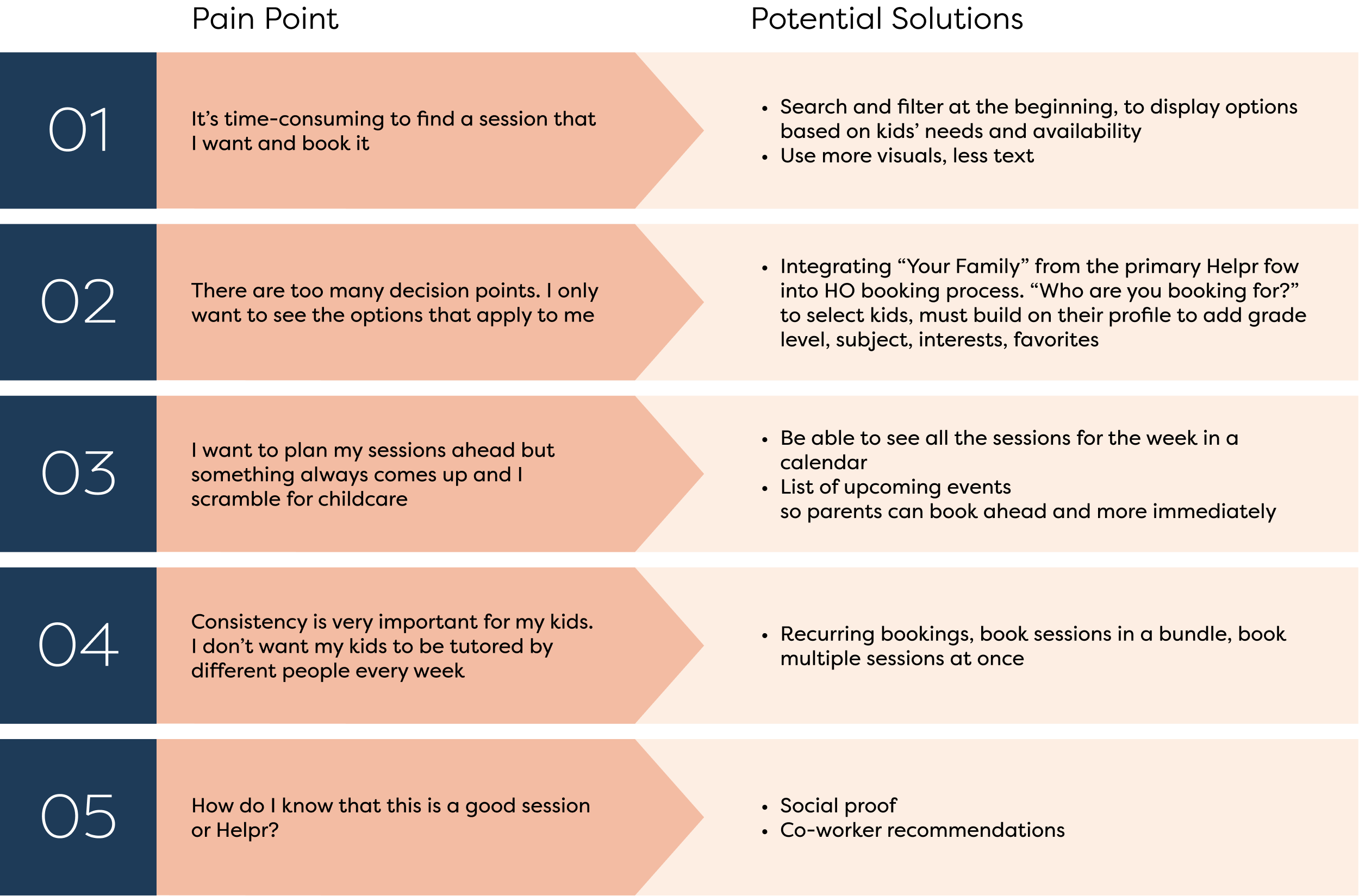
The most important insight I uncovered was:
Even though the process to book a Helpr Online session as designed was overall straightforward, testers felt it took too many steps and required too much selecting.
Parents would like to get to the point faster, be shown the few options that apply to them, and not have to make too many decisions.
Revisiting our persona
After speaking with usability testing participants, I ultimately learned that they wanted more from the service and the design than was being offered, outside the scope of booking sessions. So, I revisited the persona to capture these newly uncovered motivations and needs.

Making room for growth
I highlighted the top five pain points from usability testing and suggested a few ways that those could be addressed. With regards to booking Helpr Online sessions, they wanted a more optimized process — personalized results, fewer steps, social proof, and calendar views.
It turns out, users have different motivations and needs for Helpr Online, especially due to the circumstances brought on by the pandemic, compared to primary Helpr services and want different features to meet those needs.
This is just the beginning, I recommended some features that could help users meet their needs, but this could be a launching point to grow Helpr Online as an even more valuable service for users.
In Summary
This project began as adding a new feature to an existing app: Helpr wanted to integrate the booking of its Helpr Online services into its existing app to create a more harmonious and seamless experience for their users.
Since Helpr Online is a new service, there was little data on how users were experiencing booking the service, and thus, uncertainty as to how to approach the new feature and which direction to go. Therefore, I decided to validate the feature at a basic level, align my design to existing user expectations as much as possible, collect baseline data on the user experience, and hopefully produce actionable insights from this process to inform next steps.
In the end, I discovered that I'm actually at a launching point for Helpr Online. My work highlighted the importance of the UX design process for Helpr as it resulted in valuable data for future decision making and insights about their users to improve Helpr Online as a service. If Helpr continues with the UX design process, there is great potential to develop a product that could support many families during this unprecedented time.
Discoveries
Understand the technical capabilities and constraints from both the front and back-end early. As an external designer, I didn't have insight into Helpr's product development process, so there were times when I questioned, "Is it possible to do this?" or "Would this work on the backend?" I also wasn't sure what it meant to use SimplyBook's API. While I was able to get some questions clarified, the back and forth with Helpr bit into the time I had for this project. For the sake of time, I decided to keep the design simple and aligned with SimplyBook, so as not to introduce elements that may not be possible.
Keep design files tidy and maintain (or create) a robust style guide and component library so that other designers can pick up where you left off. Since I was designing a feature within an existing app, it was important that I follow the rules of Helpr's design system to create a consistent product. Before I could start designing anything new, I found that it took extra effort and time to figure out these rules and specs, like how buttons look in different states or margin size, by studying the design file. Design systems can be developed and adapted over time, but are important to ensure alignment across designers and developers.