
UX CASE STUDY
Using Spare Change to Create Real Change


Duration
110 hours
Organization
Designlab
Role
Research, information architecture, branding, UX/UI design, prototyping and usability testing
Tools
Figma
In this hypothetical project, an undisclosed high net worth individual (HNWI) and philanthropist wants to make it easier for people to help address the world’s greatest challenges. In reality, this idea stemmed from my background in international development and poverty alleviation. I believe that there are many issues that need more attention and resources, and SpareChange is a platform that can empower people to support the causes they care about.
SpareChange rounds up every purchase to the nearest dollar and saves it until you're ready to donate to an organization of choice.
I developed an interactive prototype for the mobile app from end-to-end, starting with exploratory research, to defining the product, creating the brand identity, wireframing, prototyping, and usability testing.
CHALLENGE
Empowering People to Support Causes they Care About
Nonprofit organizations and charities play a vital role in building healthy communities by providing critical services that contribute to economic stability and public welfare. I know from experience, non-profits and charities are always fundraising and in need of more resources, and yet, I often feel like I don't support these organizations as much as I would want to.
I wondered if there were other people like me, and if there were, what kind of impact could we make if we could collectively support important issues and causes?
Some reasons why people don't donate more, even though they may want to, are
lack of financial resources, especially during this pandemic,
not being able to prioritize or budget for charitable giving,
and uncertainty about what organizations to which to donate.

How might we enable people to more easily support the causes they care about?
RESEARCH
Discovering Habits and Pain Points
I wanted to know if this was a need or pain point that other people experienced too. I sought to understand the charitable giving landscape, the finance app ecosystem, and people's habits towards managing their personal finances.
Goals
Understand potential users habits around managing their personal finances, saving, and donating money
Look at different finance apps and identify value add, primary features and functions, design patterns, and app organization
Validate product idea
Understanding the problem space
Before I could move into solutions, I needed to first understand the problem space. My research combined:
Market research and literature review to get a broad understanding of economic trends and anthropological or psychological research that has been conducted on charitable giving and money management,
Empathy interviews with six participants to understand people's habits and inclinations around performing financial transactions on their mobile phones and charitable giving, and
Competitive analysis to learn about the different kinds of finance apps, identify strengths and weaknesses, and determine where SpareChange can fit in this ecosystem. I also incorporated user interview observations into the competitive analysis.
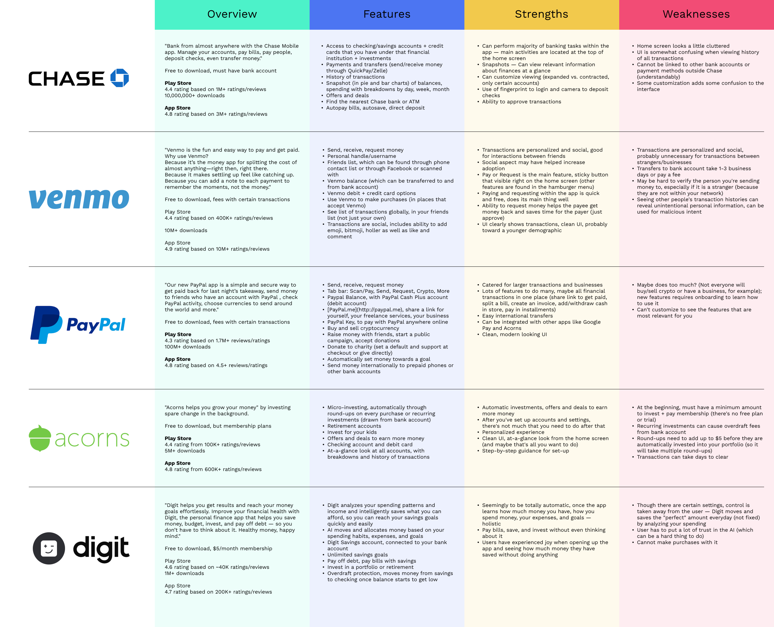
Uncovering the barriers to charitable giving
On a market level, there is a range of finance apps out there, supporting different financial transactions and goals — banking, making payments, sending and receiving money, saving, investing, budgeting — and user interviewees all had more than one type of finance app on their phones. None had a donation app.
Secondary research revealed that in 2019-2020, approximately 64% of Americans donated money to non-profits or charities but charitable giving has declined in recent years.
Furthermore, it confirmed the sentiment that we support charities in one way or another, but often we struggle to make donations as often as we think we should.
Some reasons why people don't donate (even though they may want to) is
the feeling that they lack the financial resources
uncertainty as to where to donate because there are a lot of organizations out there, and
charitable giving treated as discretionary spending or opportunistic, so it doesn't occur if the opportunity doesn't arise (like in a disaster).
I encapsulated this research into a persona: Aaron James. Aaron is committed to making donations to support important causes, but it is important that Aaron is ultimately in control of his money.

DEFINE
Building the Foundations of SpareChange
Research confirmed that there was appetite for an app that enabled more charitable giving and also revealed that whatever app it may be, it had to:
Give people full control of their money and preferences
Be able to integrate seamlessly into their lives, as to not be another finance app that they have to manage or stores all their information
Reduce the tediousness of researching and donating to charities
Build trust with users so they feel like their information and transactions are secure
Goals
Define the main features of the app
Determine the screens and UI elements that need to be designed
Outline the app's organization and information architecture
Determining main features
For the MVP of this app, I decided to focus on three main tasks — onboarding, setting up recurring donations, and making a one-time donation. The main features of the app would include:
Automation or recurring transactions so that people don't have to spend time manually saving money or making donations.
Round-ups, where purchases are rounded up to the nearest dollar and the difference is saved to a balance.
Donations are often thought of as a secondary expense and therefore, people do not set aside money for them, but this feature would enable people to prioritize saving without having to think about it.
Apps like Acorns have demonstrated that round-ups don't seem like a lot of money but could add up to a lot. It would also help people feel more comfortable if money wasn't pulled out of their accounts so often.
A SpareChange Key, which acts like a credit card. Purchases made with the SpareChange Key are the only purchases that are rounded up, giving people further control of their money.
Interviewees expressed they didn't want all of their purchases rounded up, they wanted to choose which purchases.
A centralized place for donating to many different, credible non-profit organizations or charities.
A pain point to donating to many organizations is the process of donating itself — once they have decided on an organization, they have to visit the organization's website, often make an account, enter in their information, and submit — a process that is repeated to every organization that donate to and oftentimes, every time they make a donation.
Outlining the app's structure and functionality
How would these features look like on an interface?
Mapping the primary flows
With Aaron, primary features, and tasks in mind, I created a user flow to help me visually understand the context in which Aaron may be using the app and outline high-level flows he must take to complete the tasks.

Structuring the information architecture
This naturally led to thinking about the app's organization, menu items, and other features that it needs to have in order to make it feel like a complete app.
Making a donation would be the primary flow of the app, but users would also want to know more about their balance or see their personal information.

Sketching the UI
Based on the user flow and app map, I sketched out initial wireframes with the specific screens and UI elements that I identified to complete the primary flows. I used common design patterns I saw in finance apps as a basis for these wireframes. In reviewing the wireframes, I would iterate and reorder the screens so they follow a logical, natural sequence.

BRAND
Developing the SpareChange Identity
SpareChange will handle financial transactions, which means that building trust and making sure users feel secure with their money and personal information is essential. Additionally, SpareChange is about doing good and supporting our communities, which evokes feelings of generosity, warmth, and fulfillment.
In other words, the SpareChange brand had to be professional, sleek, systematic, and practical, which is what we expect from finance apps, as well as personable, sincere, and empowering.
Goals
Distill the SpareChange brand into a logo, color palette, and typescale
Create a pattern library of reusable components based on Material Design
Researching, selecting, reselecting, revising, iterating
Developing SpareChange's brand was a process of researching, trying different combinations, sketching, and iterating.
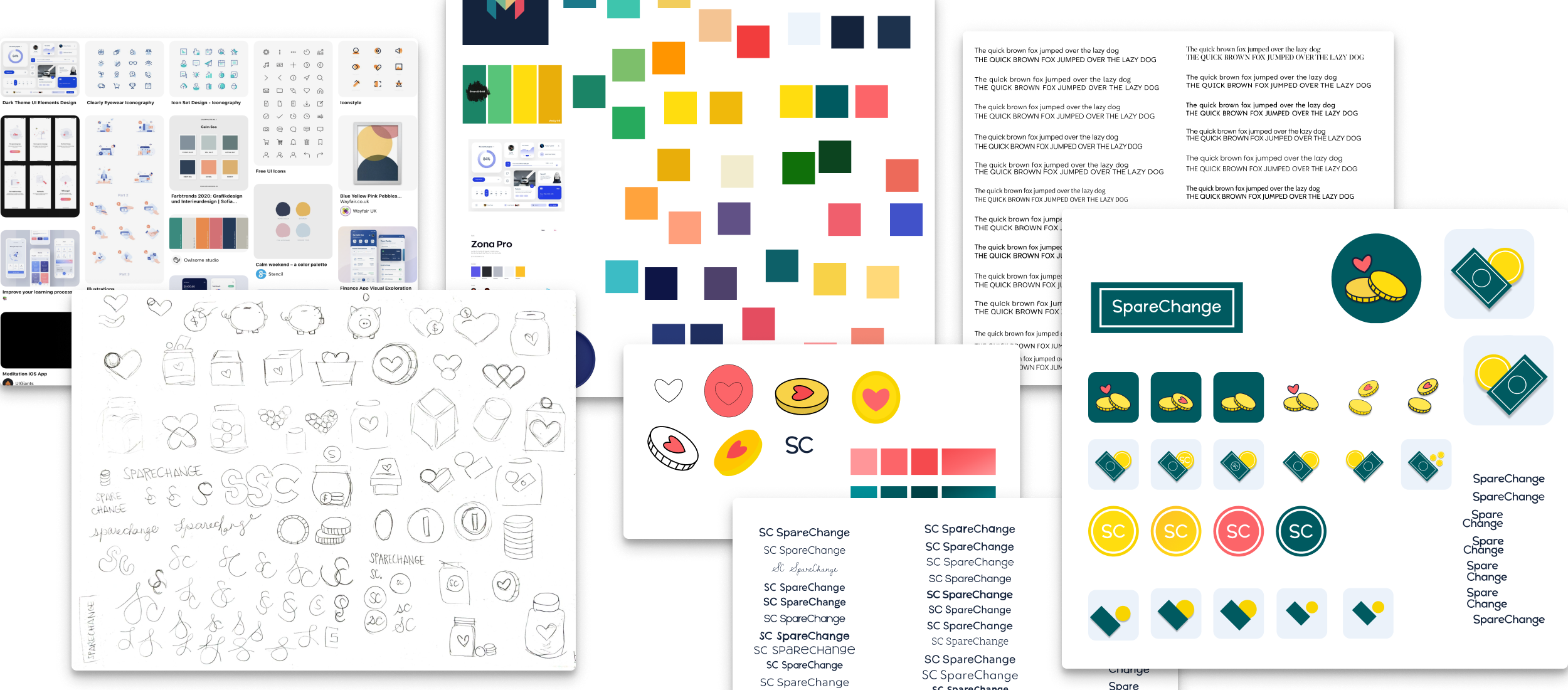
The process culminated into a style tile of fonts, colors, icons, and the logo that communicate the essence of the brand for web and UI design.

For colors, I chose blue to evoke feelings of security, trust, and calm. Yellow for joy, optimism, and warmth. Purple for compassion and to align with other humanitarian branding.
Building a Material theme
I applied the brand to Material Design, to create a customized pattern library that would be used to create mid- and hi-fi wireframes later on.
I chose to design for Android and Material Design to give myself a focus. As an Android user, it also makes it easier to check my work.

This was the first pattern library, it has undergone many changes over time.
DESIGN
Bringing SpareChange to Life
Now that I had laid the foundations of SpareChange — main features, lo-fi wireframes, branding, and a pattern library — I could bring all those pieces together into high fidelity wireframes and eventually an interactive prototype.
Goals
Digitize the wireframes and extend SpareChange branding to design
Develop an interactive prototype for usability testing
From paper to digital
Taking lo-fi wireframes to mid-fi wireframes, I paid attention to creating the main screens for the flows and following Material Design Guidelines.

Onboarding
As a new user to the app, Aaron will go through onboarding, which includes a welcome screen, a guided tour, creating an account, and adding a method of payment.
The guided tour explains the app concept in steps. The account creation screen gives Aaron the option to create an account with his email, but also through Google and Facebook for convenience.

Setting up recurring donations
When setting up recurring donations for the first time, Aaron will be walked through this process, similar to an onboarding flow, so that he can customize his preferences.
He can choose frequency of donations, select the type of notification, turn on automatic donations or choose to approve every donation, which is a setting I added for users who want more control of the movement of their money or feel uncomfortable with automatic withdrawals.

Making a donation
To make a one-time donation, Aaron can search for the organization he wants to donate to, browse by featured organizations or by category, and save his favorites.
He can choose to donate the entirety of his SpareChange balance or specify a specific amount. Before confirming the donation, he can review the donation details and make changes.
From wireframes to prototype
My mentor and I reviewed the wireframes for sequence before I turned them into a prototype. While developing the prototype, I focused on increasing the fidelity of the wireframes, using appropriate states, and adding user interactions for mobile. For example, users will swipe through the guided tour and there will be places where they would expect a keyboard.
TEST
Getting Feedback and Improving the Product
Usability testing was conducted with six participants within the target audience over live video chat. They were asked to test out the prototype with respect to the three main tasks and answer follow-up questions about their user experience.
Goals
Get feedback on usability of the design
Identify strengths and issues of the design
Prioritize the issues and iterate on the prototype
Collecting the findings
Testing achieved an 100% completion rate. Participants were able to complete the tasks once they figured out the app environment.
Because the app was designed similarly to other apps they've used, it felt familiar without much of a learning curve. The UI was "clean", "simple and readable", which helped them digest information, navigate, and feel like they could trust the app.
On the other hand, sometimes the design didn't align to participants expectations, indicated when they had trouble with
locating the recurring donations setting in the secondary menu
navigating to other parts of the app that were not yet built into the prototype, and
understanding the SpareChange Key component of the app.
Taking a step back to prioritize
When I set out to work on a new iteration of the prototype, I thought I had a good idea of how to tackle that process. However, I eventually found myself going around in circles not making any real progress.
I needed to take a step back in order to make the best use of the hours I had left.
Upon reflection, I realized that I only knew what the issues were and what participants wanted, but I didn't have a concrete plan as to how I was going to address them and in which order.
So, I adapted the Kano Model to categorize and outline each piece of feedback with a solution or feature that could address that feedback. For example, the issue of "confusion about SpareChange Key" became "clarify onboarding copy". This gave me a long list of actionable features that I could change in the design.
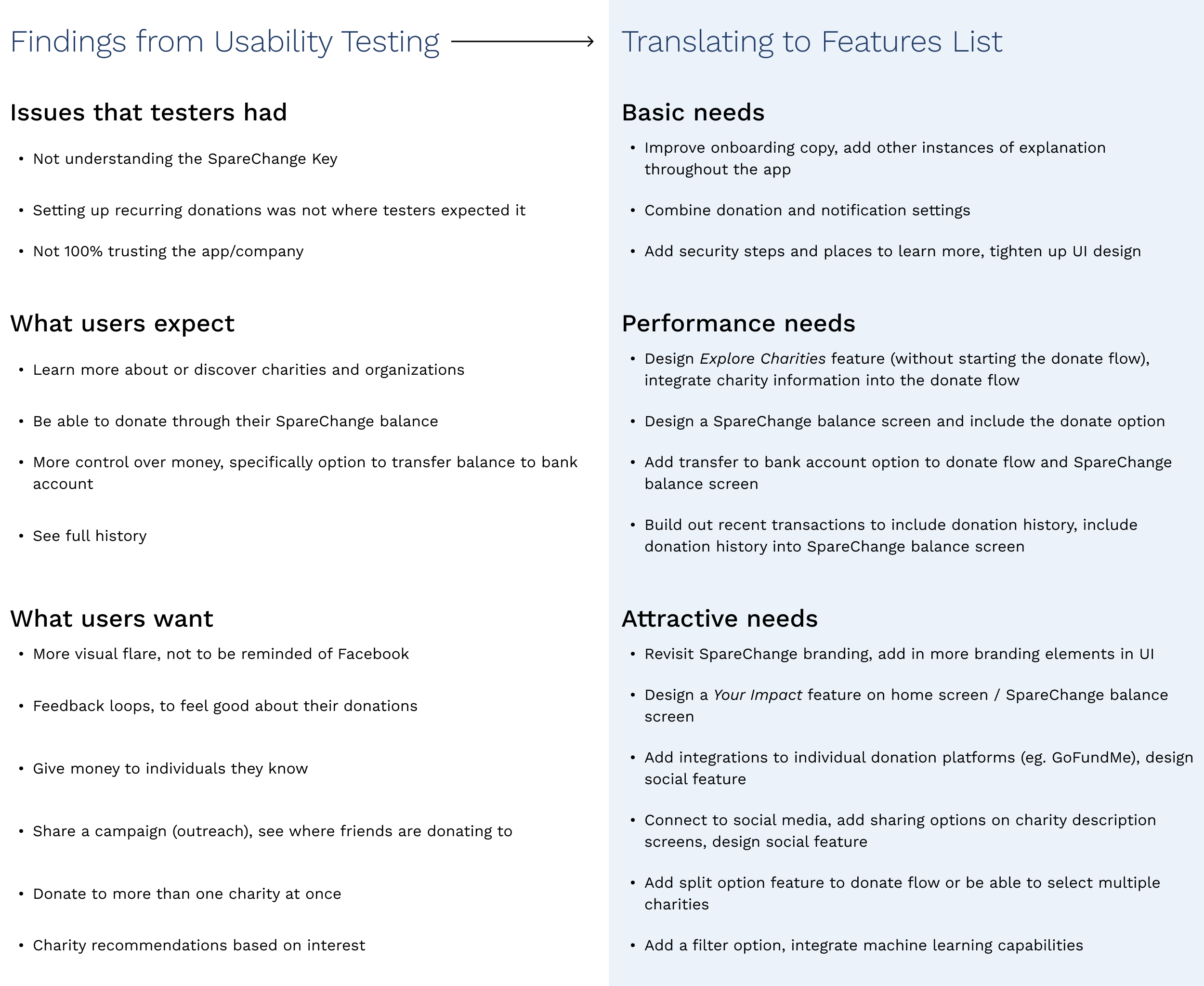
But given time constraints, I could only implement so many features on that list, so I utilized the RICE Scoring Model to help order and prioritize the list based on how valuable the feature would be with respect to my effort. Now I had narrowed down that list to 4 features, and everything else would become design debt.

Making the most impactful changes
Clarifying the SpareChange Key

Prototype 01
Participants expressed varying degrees of confusion when asked about their understanding of the SpareChange Key. In addition, in order to feel more secure and establish legitimacy, they wanted to learn more about the app before deciding to create an account.

Prototype 02
I improved the initial guided tour by clarifying the copy, adding complementary illustrations, and providing a way for users to learn more or read FAQs.

Prototype 02
If users skip the guided tour, they have another opportunity to learn about SpareChange and the Key at the end of the account creation flow and on their home screen.
Consolidating the menu

Prototype 01
For the menu, I thought that users would think to set up recurring donations under Donation Settings, but saw that they interpreted that task as setting up a type of notification, so the information architecture didn't align to their expectations.

Prototype 02
I rethought, reorganized, and cut down the menu to reduce ambiguity and overchoice. I combined Donation Settings with Notifications & Emails into one menu option.
Providing the opportunity to explore

Prototype 01
Conversations with usability test participants revealed that they expected a way to discover and learn more about organizations through the app. This feature was embedded into the donate flow, but it wasn't obvious.
Prototype 02
I added a bottom navigation bar, where I separated the Explore and Donate features. They may have different starting screens, but they are logically connected (ie. you can learn more about an organization through the donate flow and vice versa). They are just more aligned to patterns users expect when they want to make a financial transaction or explore entities.
Increasing satisfaction

Finally, because ensuring that users can trust the app is critical, I tightened up the UI, so that it is more sleek and modern. I also added loading screens with animations to increase the enjoyability of usage, especially the feeling of satisfaction when a user makes a donation.
OUTCOME
Moving Forward with Possibilities
SpareChange as an app was well-received.
Participants liked that they could donate and support important causes easily — saving money towards a donation was automatic, recurring donations would enable them to donate more often and without thinking, they didn't feel pressured to donate, and it was all done in one place.
It addressed many of the pain points that come with charitable giving, primarily the tediousness of remembering to donate, budgeting money, researching, and donating individually to the organizations. SpareChange works in the background and could be integrated easily into people's lives.
The resulting wireframes could probably be further developed into a working MVP, assuming that the backend is in order and keeping in mind that the design process isn't completed and more can be done to meet users expectations and improve the product.
Bringing in a social component
Based on conversations with participants, SpareChange is a great starting point but can be so much more.
If social features were added to the app, SpareChange has the potential to make a greater social impact.
For one, people tend to feel more confident with social proof from their friends — they would be more inclined to donate to organizations that their friends are donating to and they would spend less time validating the legitimacy of the organization.
For two, SpareChange can be a platform where people can fundraise for or promote specific causes by leveraging their social network.
For three, it can be a platform for smaller organizations to promote their work and get discovered.
In Summary
SpareChange is a hypothetical app that I designed from end-to-end:
from research, idea validation and learning about potential users and the problem space
designing the app from scratch, and
developing, testing, and iterating on a MVP interactive prototype.
Next steps would be to test the new prototype and make iterations, while researching and defining how social features may work within the app.
SpareChange empowers people to support the causes they care about because it keeps in mind their outlook and habits towards personal finance management, while addressing the pain points that come with making donations.
Discoveries
Get feedback on branding and how users feel. A brand can be a big part of a user's experience of an app. Flows can be optimized and tasks be straightforward to complete, but the success of an app also depends on how people feel about the company, and so usability testing is an opportunity to understand that side of the user experience.
Balancing SpareChange as a professional, secure finance app with one that evokes feelings of sincerity and joy was a challenge. I still don't think that I achieved this in a way that SpareChange can be a recognizable, trusted, and unique brand. Participants expressed that they could probably trust the app based on the design, but whether they felt satisfaction or warmth while using it is unclear. It reminded them of apps like Facebook and Twitter, which has its own connotations. More can done to craft and hone SpareChange's brand.
Focus on doing one thing really well. At the beginning of this project, I felt overwhelmed because designing an app from end-to-end sounded daunting. Research increased this feeling because I was getting lots of information from many different sources, and had multiple ideas as to what this app could do and its features. I decided to explicitly focus on developing the four features and three flows that were fundamental to an MVP of the app, which made this project seem much more manageable.
Make a game plan. As mentioned previously, while I was working on the next iteration of the design, I went in circles because I didn't have a clear plan as to what changes I was going to make. Although design is not a linear process, it can be a logical one; my time and effort can be better spent when my actions are informed and planned instead of diving right in.