
UX CASE STUDY
Democratizing Time Travel


Duration
4 weeks
Organization
Designlab
Role
Research, IA, IxD, UI, branding, prototyping, user testing
Tools
Figma
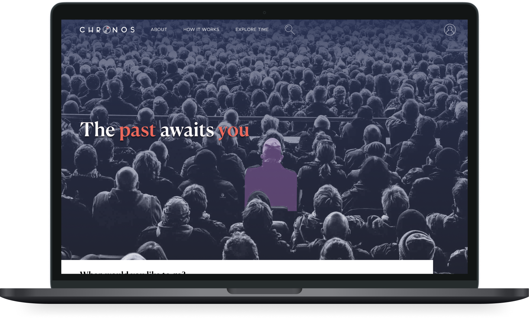
In this hypothetical project, Chronos is a time travel tourism company, offering 289 travel packages from all over the world–from prehistoric times through today. As this is a novel endeavor in a multiverse where COVID does not exist, Chronos wants to create an online platform that takes the hassle out of booking and planning travel, leaving travelers with authentic experiences and everything they need to travel with confidence and security.
I designed an interactive prototype of a responsive website, where users will be able to search, browse, save, and book trips. The design was based on user research and improved through usability testing.
CHALLENGE
Introducing a New Idea
While time travel is not something that actually exists (as far as we know), what Chronos represents is a new idea, a new technology that needs to be introduced in a way that users can easily grasp the concept and adopt it.
People will need to understand how to travel with Chronos and navigate the website.
How might we create a user experience where users can immediately feel familiar with a novel concept and understand how it works?
RESEARCH
Learning the How and Why for Travel
Fundamentally, Chronos is a new way to travel. Its competitive advantage is that it is time travel, which is exciting and compelling itself, but Chronos still must be able to address the goals and challenges that people experience with travel booking. Therefore, my research was centered around understanding that problem space and uncovering people's travel habits.
Goals
Understand users' motivations, goals, needs, and pain points for travel
Learn how people book and plan holiday travel
Combining different research methodologies
I took a mixed method approach to research combining
Market research to uncover trends in the travel, tourism, and hospitality industry,
Competitive analysis to gain insight into the travel booking/planning process, common design patterns, and ways competitors differentiate themselves, and

Potential user interviews to learn the common reasons they travel, sites or apps most used, activities they do while traveling, how they decide on their destination.
While there were a number of provisional persona that I could have explored, I decided to recruit and interview young, professional Millennials, as they travel the most and are likely to be more open to time travel. Interview participants were not given context about time travel because I wanted their primary focus to be on travel.
Uncovering trends, habits, and motivations
A few important trends came to surface from the research. Our target audience
travels to experience different cultures and what is unique to the location; they often value local knowledge and would to have experience outside the typical tourist attractions
often compares prices and reviews for different experiences before making a decision
like to have flexibility in their travel schedules and the ability to decide what to do given their preference.
In that respect, our target audience often finds that planning and deciding where to go, what to do, where to stay can often be tedious and time consuming due to various levels of information, validity of reviews, and having to compare across sites.
I developed a persona based on user interviews, and this persona guided my decisions throughout creating Chronos.

Users want to be able to search, plan, and book their travel in a way that offers flexibility and choice, trustworthiness, and efficiency.
Users want to feel assured that they are able to have the best possible experience, given their preferences and the time and money to be spent on the trip.
DEFINE
Determining Features and Site Organization
Based on competitive analysis and user research, I knew that users on a travel website would expect to be able to:
Search, browse & filter results
Create an account & onboard
Save or bookmark trips
Book a trip
Goals
Map the organization of Chronos website in order to make it understandable and navigable to users.
Determine the ways in which users will be able to search and filter trips.
Understanding tasks and flows
How would someone on a travel website complete those primary tasks?
Outlining a task flow
By looking at different travel websites, I could discern the common design patterns for these tasks and create a task flow for booking a trip. By outlining the steps to complete a flow, I could ensure that was designing sequentially, and as a precursor to designing the upcoming complex user flows.

Creating more complex user flows
Once I had a foundational flow, I could build on it to create a more complex user flow, incorporating all the primary tasks and more importantly, putting myself in Taylor's shoes and how she may need to navigate the website. The user flow helped me determine the pages and elements that needed to be designed in order to honor Taylor's choices and make sure that she doesn't get lost in the design.
Thinking about searching and filtering
Before moving on to design, it was crucial to outline how Taylor would be able to search, browse, and find a trip based on her interests. While Chronos is a travel company, the novelty and time travel component of Chronos may offer uncertainty to people who don't know how exactly what they're looking for.
Therefore, the ability to choose categories and filter to narrow down results is a necessary feature for the website, but would the categories and filter options be the same as those on other travel websites? I used card sorting to find out.
Sorting cards
I asked potential users to categorize titles of potential time travel trips, which included an event, a location, and a year/time period.
First FIFA World Cup; 1930 in Montevideo, Uruguay
The Jazz Age; 1920s in New Orleans, LA, USA
Participants mainly grouped the trips by geography (eg. Asia, Africa, etc.) or time period (eg. Prehistoric, BC, modern times). There were some groupings by genre (eg. political history, scientific innovation, art & entertainment).
Sorting cards again
The card sort produced interesting categories, but I felt that the results didn't reveal anything about user interests or motivations for travel. So I conducted the card sort again, amending each card to provide more direction.
Attend the First FIFA World Cup; 1930 in Montevideo, Uruguay
Celebrate the Jazz Age; 1920s in New Orleans, LA, USA
Even with most of the same participants, the results were different. Cards were categorized by actions or types of experiences (eg. cultural immersion, witnessing important events, live entertainment).
Mapping the site
The card sorting revealed nuanced way to search and filter trip results. I incorporated these findings, in conjunction with the task and user flows, into a site map with filter categories.
While it is familiar for users to search for trips by location and interest, users will also be able to find their perfect trip by choosing time periods or “moment in history”.
At a high-level, users can begin their search with a geography or time period, but then narrow down their results by "Moment in History" or "Reason to Travel", categories that are catered to their interests.
BRAND
Developing a Brand for Time Travel
Chronos is a new company about time traveling to the past. The Chronos brand should be
Modern & classical
Historical & fresh
In addition to being modern, classical, historical, and fresh (which is already a challenge as it is), I also wanted it to be spectacular and different, even mystical, because it's time travel.
Goals
Design a logo and select a color palette and type that reflects Chronos’ brand.
Develop a design system with a style guide and pattern library
Visually representing Chronos
Developing Chronos' brand began with research, mood boarding, and gathering inspiration. Each element of the brand went through more than one iteration, where I tried out several different ideas, received feedback, and iterated based on that feedback.
Designing the logo

Creating the style tile
I created a style tile and pattern library to use throughout the website, primarily focused on desktop. This helped me create designs quickly and maintain the brand’s aesthetic.

DESIGN
Putting All the Pieces Together
Now that I understood what the Chronos website had to include at a high-level and the building blocks of the UI, I could start designing.
Goals
Identify and design the product requirements that would enable a user to complete expected tasks
Create wireframes, ensuring that they are in line with determined pages and UI elements from the user flow and site map
Develop a prototype from hi-fi wireframes, building in user flows and incorporating branding
Incorporating flexibility, trustworthiness, and efficiency
The deliverables created in the Define stage of this process helped me identify what needed to be designed, which I manifested into responsive wireframes based on common design patterns for our tasks.

These lo-fi wireframes depict some layout options I considered for the homepage.

These responsive wireframes incorporate the features listed in a UI Product Requirements document. I kept in mind what features users would need in order to complete their tasks while designing every screen.
Keeping in mind users motivations and pain points, I also incorporated elements that would offer flexibility and choice, trustworthiness, and efficiency for their travel.

Flexibility
Trips pages give users the ability to personalize their trips by adding on activities or food & drink and by choosing their room. On the left-hand sidebar, users have full transparency and can see the price of the trip auto-calculate based on their choices.

Trustworthiness
Trip pages include reviews from previous travelers, a feature that is important for our users. Reviews provide social proof and helps build credibility. As Chronos gets more popular, it would be useful to consider linking out to external sources.

Efficiency
Trip pages are comprehensive and provide users with all the relevant information they need about a trip. Users can view the trip at a glance at the top, scroll down to review further details of the trip, and navigate to different section using the side bar.
Increasing the fidelity
I could then increase the fidelity, apply the branding to the wireframes, and develop a prototype for usability testing. I walked through each flow with my mentor to identify and address any obvious issues.
TEST
Putting the Design in Front of Users
Usability testing was conducted with seven participants, using a combination of testing the prototype on Maze, real-time listening of the participant thinking aloud while taking the test, following along as they navigated the prototype on Figma, and follow-up phone calls. Participants were given brief context of Chronos and were asked to complete three tasks:
Search for a specific trip and start the booking process
Navigate to Popular Trips and save three trips (which included onboarding steps)
Visit their Saved Trips and share
Goals
Test prototype for usability
Identify strengths and issues of design, prioritize which issues to address in next iteration
Gathering user feedback
Overall, participants thought that completing the tasks were straightforward and intuitive because of familiar aspects of the interface.
“Worked pretty much as expected. The Popular tab was placed easy to find and the save function icon was easy to use.”
I gathered user feedback and categorized them into an affinity map. This helped me identify the areas where users were having the most issues and prioritize them.

Improving the design
I learned that once participants were able to get to the results page, they are able to find their way and complete their tasks in an easy, intuitive way. So, how could I optimize the homepage so that it gets users to the results page faster?
I iterated based on user feedback, addressing the main issues of:
Not all features were functional, meaning that participants may have initially tried other ways of completing the tasks than was available
Lack of visibility of features (one participant did not see the profile icon, and
Unclear copy.
Optimizing the homepage
Prototype 01
Hero image takes up most of the screen
Profile icon is hard to see

Prototype 02
Search bar is visible when a user lands on the page
Increased contrast improves readability of text and visibility of other features
Copy added for clarity
OUTCOME
Opening the Gateway
Overall, users found that while time travel is a novel concept, they felt that they could still navigate and use the newly designed website to search, save, book, and plan their travel.
Before showing usability testing participants the website (prototype), I introduced Chronos as a time travel tourism company, and I was met was uncertainty. How was it going to work? They surprisingly had never seen a website for time travel before and didn't know what to expect. But when they explored the prototype, they began to feel more comfortable with the unfamiliar.
The website is like a gateway for people to begin their time travel journey. With a responsive website where people could easily grasp the concept of time travel, and meet their needs for planning and booking travel, Chronos is one step closer to fulfilling their mission to democratize time travel.
Shifting expectations in the time of COVID
As designed, this website assumes that it operates in a COVID-free multiverse and is similar to travel and tourism sites pre-pandemic. This was the framing in which I conducted the research.
However, in order to meet the expectations of users during the pandemic, some parts of the design may need to be changed. For example, creating and emphasizing a section for health and safety protocols. Or, making it easy to get in touch with the company in case of questions or concerns. More research will need to be done to uncover these expectations and design for them.
In Summary
In this hypothetical project, I designed a responsive travel website and created a brand for the time travel tourism company, Chronos.
To design this website, I
began with user research to uncover motivations, pain points, and habits around travel
defined the websites features, paying close attention to how users will search and browse results or time travel packages
relied on common design patterns to help users feel familiar with the concept, incorporating elements that addressed their need for flexibility, trustworthiness, and efficiency when booking and planning travel, and
tested my design with potential users and iterated based on their feedback.
As a result, I produced an interactive prototype, where people felt familiarity with the interface and met their expectations for a travel website.
Discoveries
Perform live usability testing when asking participants to complete very specific or complex tasks. I was unable to preform some usability testing in real-time with participants, so I also used a platform where participants could complete the tasks remotely and without a facilitator. This method relied on writing instructions that were clear and concise, and participants reading them carefully. I saw that without a facilitator, participants made more errors, possibly because they didn't fully understand what it meant to test a limited prototype or forgotten the directions. The choice for usability testing methodology has to be best suited for what kind of test we are aiming to conduct and what we're trying to learn.